Human at heart
Warm, welcoming and grounded in real hospitality. Food businesses are people, not order numbers.

One shared identity for everything Servd. A practical guide to our logo, colors, typography and voice — from the first tap to the last table.
Get brand assets ServdThe food commerce platform.
Servd connects ordering, kitchens, payments and growth so food businesses can focus on the food and the people in front of them.
Your whole service. One place.
Warm, welcoming and grounded in real hospitality. Food businesses are people, not order numbers.
Make the next step obvious. Give busy teams useful information, room to breathe and words they understand.
From a menu to a kitchen ticket, every touchpoint should feel like part of the same service.
Use the original Servd symbol. Violet on light surfaces, white on dark surfaces. Pair it with the Servd name where context calls for it.
Keep at least half the symbol’s width clear on every side. Keep text, edges and other marks outside this space.
Use the standalone symbol at 24px or larger. Check legibility at the final output size.
Violet leads. Dark ink gives our words weight. White space keeps things clear. Supporting colors bring warmth to stories and illustrations.
Lead with white, ink and violet. Use lilac, peach and mint as supporting surfaces, with dark ink for readable text. Supporting colors are not status indicators.
:root {
  --servd-violet: #4f18db;
  --servd-ink: #20213e;
  --servd-white: #ffffff;
  --servd-lilac: #d9c8ff;
  --servd-peach: #ff9b78;
  --servd-mint: #a7e3c4;
  --servd-font: 'Rubik', sans-serif;
}Rubik is our core typeface, with Arabic and Latin in one family. Confident headings, friendly curves and clear body copy keep Servd familiar in both languages.
Good food.
Great service.
أكل حلو. خدمة أحلى.
Use 1.5–1.7 line height for body text. Align paragraphs to the reading direction. Do not add letter spacing to Arabic. Instrument Serif is a homepage display accent; Rubik carries the shared brand.
Use a 4px spacing base. Build a clear hierarchy with generous margins, rounded surfaces and fewer competing elements.
Use 16–24px mobile gutters and width-capped desktop content. Keep long paragraphs comfortably readable. Stack columns when content needs more room.
Use 12–14px corners for controls and 24–32px for larger cards and photography. Reserve violet for the primary action. Keep shadows subtle.
Food photography is part of our identity. Let texture, ingredients and the craft of hospitality tell the story.
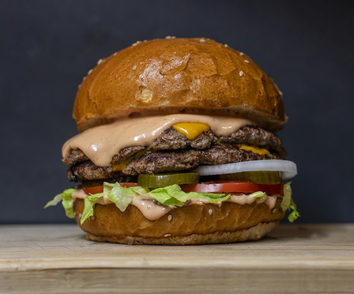
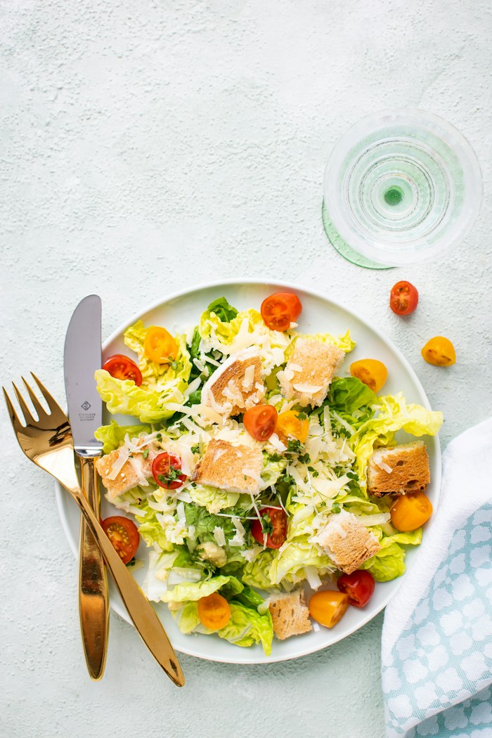
Choose natural light, rich texture and an honest view of the dish. Keep text off busy areas. Use photography you have permission to publish; preview images are not included in the brand kit.
Be warm, direct and specific. Talk about what the merchant can do and what happens next. Write Arabic for the people reading it, with natural local phrasing.
Less admin. More good service.
From a social post to an app icon, use the same mark, palette and type. Keep one clear message and give the food room.
Use the original symbol with generous padding. Native and web products share the current landing identity.
Legibility and access are part of the brand. Check every surface in both languages, on small screens and with a keyboard.
8.4:1 contrast ratio. Suitable for normal text at WCAG AA and AAA.
Original logo files and a small set of shared tokens. Use these assets when writing about Servd or building with our identity.
Kit includes violet and white SVG/PNG symbols, app icon, CSS tokens and usage notes. These assets identify Servd; do not imply a partnership or endorsement.